Major Project - [VFX] - Kickstarter, Alex's Channel, Digital Countdown & Progress Bar
Creating After Effects Composites
As part of my responsibilities as D.O.P. (Director of Photography) it was agreed upon that I would work to create any VFX assets that were required for our 'DreamChaser' documentary. These would include elements such as lower thirds for establishing characters and locations throughout the journey, professional looking renders of web-pages of note such as the Kickstarter page for our project as well as Alex's YouTube channel, and of course some form of countdown timer to indicate the time remaining before the race begins. We figured that given that I was the most experienced in the group when it came to using advanced visual FX software like Adobe After Effects, it would make the most sense for me to be in charge of things in that area, especially given my focus on that aspect of film-making when it came to mine and Alex's transition unit Facebook documentary last year.
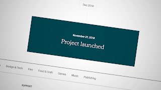 The first and simplest task I set myself was putting together the close-up composites of the aforementioned web-pages. I wanted to give as much material to George for him to incorporate into the edit as possible, so I recorded as much footage I could of both the 'DreamChaser' Kickstarter page and Alex's YouTube channel. This included elements such as the crowdfunding timeline, the 'Project Backed' notice, the front page of the campaign and the process to set-up a Kickstarter campaign in of itself. As for his channel I recorded his channel home page, his subscriber count, his 'about' page which lists the total number of cumulative views that his channel has received and of course several of his more popular videos. All of this material was recorded natively using Nvidia's GPU software known as 'Nvidia Shadowplay' - this allows the user to capture desktop footage up to 4K (3840x2160) 60 frames per second, with next to no performance impact or latency when recording.
These raw recordings were then placed into a new After Effects composite at which point I began working on them. I used similar techniques that I used during the Facebook Transition unit last year, i.e. zooming into points of interest using the 'Scale' parameter and rotating slightly to give a sense of depth to the image. I then added a 'CC Vignette' on top of these clips and adjusted the intensity and feathering until I achieved the desired look. Despite me recording this footage at 1440p (2560x1440), for the clips that were scaled up substantially I added an additional layer of 'Sharpening' in order to alleviate some of the loss in quality you would see by punching in to such a degree. In some cases I also animated some subtle movement onto these clips to add yet another layer of dynamism to the entire look of these VFX; I'm a big believer in the idea that a still frame is a bad frame, so any kind of movement regardless of how subtle it may be, is better than none. These clips were then lined up next to each-other in a single After Effects timeline and exported so that George could easily pick and choose what portions of the VFX he wanted to use, inserting them as he would a normal video file.
After those were out of the way I wanted to put together some kind of countdown clock to be shown throughout the documentary during the 'Stings' sections that are used to bridge together certain sequences. We floated several ideas as a group, but in the end we settled with a traditional digital style, 6 figure clock, that would tick down intermittently. In order to create this effect I had to generate the entire thing from scratch - I started by inputting the 6 zeroes onto the screen in the form of basic text layers, from there I was able to add the text above and below the timer itself, providing important information like 'Days, Hours, Minutes' and 'Until The Race' which indicates to the audience what purpose the countdown is serving. I went with a traditional digital clock style font known as 'Digital-7' as I believed this suited both the tone and topic of the documentary. I also added a secondary layer of numbers underneath the existing layer and decreased their opacity by half. This gives the impression that there's an underlying set of LED's that light up in correspondence with the countdown timer numbers, this was not necessary however it helped further highlight the focus on a digital clock style. Now in order to animate the numbers in the way that you see them in these images, I had to add a 'Slider Control' to each of the sets of numbers individually, which I could then use in order to control the number displayed at any given time.
By using the 'Pick-Whip' tool, I linked the text with the slider control directly, meaning the text would be tied to whatever number the 'Slider Control' was set to, thus allowing me to animate the numbers as needed. Unfortunately when using key-frames to animate said numbers they 'tween' by default, meaning between one key-frame and the other you see the number move upwards towards the end number. For example, if at second 1 the slider was set to '25' and at second 2 it's set to '24', you would see the number go from 25 to 24.9999, 24.8888, 24.7777 etc. In order to fix this you can highlight the key-frames and select the option 'Toggle Hold Key-frames'. This essentially freeze-frames the key-frame to the first image of each one, preventing the 'tweening' from occurring. Once this was achieved, all I had to do was repeat this for 10-15 seconds/frames in order to achieve the countdown effect. Sound effects can then be added in later by George which will help complete the look. I then did the same for 6 other times: 30 days, 25 days, 18 days, 10 days, 5 days and finally a countdown for the last 3 minutes before the race, to be used directly before the race begins. I also created a transparent version without the solid grey in the background so that they could essentially be overlaid on to any image in the same way that PNG files work, this would give George more flexibility when it came to creating the look of the stings. You can also apply any kind of Premiere Pro video effect to these as you would with any other clip - for example you could add something like a drop shadow, entrance/exit transition etc to differentiate them from the background imagery, as well as further increase production value.
I also created an animated progress bar so that we could have a visual representation of the crowdfunding campaign for the audience. To create this I found a PNG of a timeline on the internet, which I then imported into After Effects and used a 'Color Replace' to change the colour from white to grey, this was done so that the white text showing the '£800 Goal' and 'DreamChaser Kickstarter Fund' didn't clash too much with the timeline itself. The text was then animated so that it would move down closer to the timeline when shown which added production value, though the movement was 'eased' in order to make the animation smoother on the eyes. When it came to the progress bar in of itself, there were several options I had in mind, however I went with a traditional rounded style white bar which would fill up with a secondary green bar on the above layer. The animation was achieved by only key-framing the green layer from one side of the screen to another, but by placing it under a mask, it only fills out the area occupied by the white bar. There's also a percentage number that changes and animates alongside the green bar in order to show the state of the crowd-funding campaign. This was achieved by creating a standard solid shape and then 'pick-whipping' a 'Slider Control' effect to a text layer in the same way that I did with the countdown clock mentioned above. All of the elements were then 'eased' in order to give a much smoother sense of progression, before being exported with a transparent background for the same aforementioned reasoning.
The only other aspect of VFX that I handled, not including the introductory sequence was the creation and implementation of lower thirds. I went with a fairly basic design that incorporated a basic masking feature in which text reveals itself from behind a white stroke that animates outwards, then back into itself. This creates a smooth looking animation effect that's easy on the eyes and looks of a professional standard, there's also room to adjust the style of these fairly easily to suit both a horizontal and vertical format. You can see the lower thirds below:
Being able to work on VFX like these is always interesting to me as it tends to be a learning process regardless of how much experience I have in doing so. Software like After Effects and Premiere Pro have an enormous amount of potential when it comes to the effects you can implement and techniques you can learn to help your workflow, so I'm grateful for the opportunity to do so.
As part of my responsibilities as D.O.P. (Director of Photography) it was agreed upon that I would work to create any VFX assets that were required for our 'DreamChaser' documentary. These would include elements such as lower thirds for establishing characters and locations throughout the journey, professional looking renders of web-pages of note such as the Kickstarter page for our project as well as Alex's YouTube channel, and of course some form of countdown timer to indicate the time remaining before the race begins. We figured that given that I was the most experienced in the group when it came to using advanced visual FX software like Adobe After Effects, it would make the most sense for me to be in charge of things in that area, especially given my focus on that aspect of film-making when it came to mine and Alex's transition unit Facebook documentary last year.
 The first and simplest task I set myself was putting together the close-up composites of the aforementioned web-pages. I wanted to give as much material to George for him to incorporate into the edit as possible, so I recorded as much footage I could of both the 'DreamChaser' Kickstarter page and Alex's YouTube channel. This included elements such as the crowdfunding timeline, the 'Project Backed' notice, the front page of the campaign and the process to set-up a Kickstarter campaign in of itself. As for his channel I recorded his channel home page, his subscriber count, his 'about' page which lists the total number of cumulative views that his channel has received and of course several of his more popular videos. All of this material was recorded natively using Nvidia's GPU software known as 'Nvidia Shadowplay' - this allows the user to capture desktop footage up to 4K (3840x2160) 60 frames per second, with next to no performance impact or latency when recording.
These raw recordings were then placed into a new After Effects composite at which point I began working on them. I used similar techniques that I used during the Facebook Transition unit last year, i.e. zooming into points of interest using the 'Scale' parameter and rotating slightly to give a sense of depth to the image. I then added a 'CC Vignette' on top of these clips and adjusted the intensity and feathering until I achieved the desired look. Despite me recording this footage at 1440p (2560x1440), for the clips that were scaled up substantially I added an additional layer of 'Sharpening' in order to alleviate some of the loss in quality you would see by punching in to such a degree. In some cases I also animated some subtle movement onto these clips to add yet another layer of dynamism to the entire look of these VFX; I'm a big believer in the idea that a still frame is a bad frame, so any kind of movement regardless of how subtle it may be, is better than none. These clips were then lined up next to each-other in a single After Effects timeline and exported so that George could easily pick and choose what portions of the VFX he wanted to use, inserting them as he would a normal video file.
By using the 'Pick-Whip' tool, I linked the text with the slider control directly, meaning the text would be tied to whatever number the 'Slider Control' was set to, thus allowing me to animate the numbers as needed. Unfortunately when using key-frames to animate said numbers they 'tween' by default, meaning between one key-frame and the other you see the number move upwards towards the end number. For example, if at second 1 the slider was set to '25' and at second 2 it's set to '24', you would see the number go from 25 to 24.9999, 24.8888, 24.7777 etc. In order to fix this you can highlight the key-frames and select the option 'Toggle Hold Key-frames'. This essentially freeze-frames the key-frame to the first image of each one, preventing the 'tweening' from occurring. Once this was achieved, all I had to do was repeat this for 10-15 seconds/frames in order to achieve the countdown effect. Sound effects can then be added in later by George which will help complete the look. I then did the same for 6 other times: 30 days, 25 days, 18 days, 10 days, 5 days and finally a countdown for the last 3 minutes before the race, to be used directly before the race begins. I also created a transparent version without the solid grey in the background so that they could essentially be overlaid on to any image in the same way that PNG files work, this would give George more flexibility when it came to creating the look of the stings. You can also apply any kind of Premiere Pro video effect to these as you would with any other clip - for example you could add something like a drop shadow, entrance/exit transition etc to differentiate them from the background imagery, as well as further increase production value.
I also created an animated progress bar so that we could have a visual representation of the crowdfunding campaign for the audience. To create this I found a PNG of a timeline on the internet, which I then imported into After Effects and used a 'Color Replace' to change the colour from white to grey, this was done so that the white text showing the '£800 Goal' and 'DreamChaser Kickstarter Fund' didn't clash too much with the timeline itself. The text was then animated so that it would move down closer to the timeline when shown which added production value, though the movement was 'eased' in order to make the animation smoother on the eyes. When it came to the progress bar in of itself, there were several options I had in mind, however I went with a traditional rounded style white bar which would fill up with a secondary green bar on the above layer. The animation was achieved by only key-framing the green layer from one side of the screen to another, but by placing it under a mask, it only fills out the area occupied by the white bar. There's also a percentage number that changes and animates alongside the green bar in order to show the state of the crowd-funding campaign. This was achieved by creating a standard solid shape and then 'pick-whipping' a 'Slider Control' effect to a text layer in the same way that I did with the countdown clock mentioned above. All of the elements were then 'eased' in order to give a much smoother sense of progression, before being exported with a transparent background for the same aforementioned reasoning.
The only other aspect of VFX that I handled, not including the introductory sequence was the creation and implementation of lower thirds. I went with a fairly basic design that incorporated a basic masking feature in which text reveals itself from behind a white stroke that animates outwards, then back into itself. This creates a smooth looking animation effect that's easy on the eyes and looks of a professional standard, there's also room to adjust the style of these fairly easily to suit both a horizontal and vertical format. You can see the lower thirds below:
Being able to work on VFX like these is always interesting to me as it tends to be a learning process regardless of how much experience I have in doing so. Software like After Effects and Premiere Pro have an enormous amount of potential when it comes to the effects you can implement and techniques you can learn to help your workflow, so I'm grateful for the opportunity to do so.


"Great green screen studio setup!
ReplyDeleteThe lighting and space look perfect for clean chroma key shoots.
Ideal for VFX, promo videos, and creative virtual productions.
Amazing facility — truly helps bring imagination to life!"