Pre-Production Unit - Designing A Concept Title
Shaping My Series
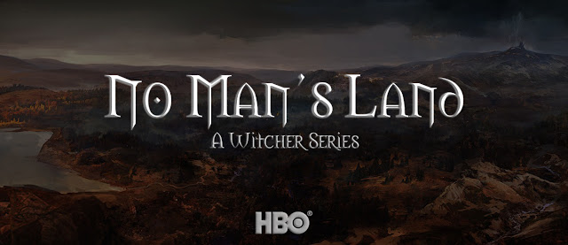
As part of bringing my series into existence, I wanted to produce a concept art title card that could be used during the production of the package. I did this in Photoshop and it can be viewed below:
This look was created by taking an existing piece of artwork from the development of The Witcher 3: Wild Hunt, depicting the area of Velen (No Man's Land), creating a large black rectangle on a layer above said image and lowering the opacity in order to achieve the dimmed look in the background, thus highlighting the key information within the image I.e. the text.
 Additionally the font used for both the title and the subtitle is the same font used in the large majority of The Witcher related marketing in the past, that font being 'Morpheus' which can be seen in this image (pictured right).
The subtitle 'A Witcher Series' is slightly darker in colour to match the same silver aesthetic that is also reflected in this image, given that silver is relevant to the story with it being the only material that is capable of effectively slaying monsters. Witchers are known for carrying 2 swords -- 'Steel for Humans, Silver for Monsters'.
Then as a final touch both pieces of text had an inner bezel applied to them as well as a minor outer glow to make them stand out even more so from the background image - this allows the text to have more depth than it initially had and really helps make it pop.
As part of bringing my series into existence, I wanted to produce a concept art title card that could be used during the production of the package. I did this in Photoshop and it can be viewed below:
This look was created by taking an existing piece of artwork from the development of The Witcher 3: Wild Hunt, depicting the area of Velen (No Man's Land), creating a large black rectangle on a layer above said image and lowering the opacity in order to achieve the dimmed look in the background, thus highlighting the key information within the image I.e. the text.
 Additionally the font used for both the title and the subtitle is the same font used in the large majority of The Witcher related marketing in the past, that font being 'Morpheus' which can be seen in this image (pictured right).
The subtitle 'A Witcher Series' is slightly darker in colour to match the same silver aesthetic that is also reflected in this image, given that silver is relevant to the story with it being the only material that is capable of effectively slaying monsters. Witchers are known for carrying 2 swords -- 'Steel for Humans, Silver for Monsters'.
Then as a final touch both pieces of text had an inner bezel applied to them as well as a minor outer glow to make them stand out even more so from the background image - this allows the text to have more depth than it initially had and really helps make it pop.


Comments
Post a Comment