Pre-Production Unit | No Man's Land - A Witcher Series | Compositing My Title Sequence /w Adobe After Effects
Composition of Title Sequence /w After Effects
Putting together a professional looking, industry standard title sequence was one of my core aspirations during this project. In order to ensure I met the requirements of my ideal platform HBO, I underwent substantial After Effects work in order to create the aesthetic that I had envisioned for 'No Man's Land - A Witcher Series'. The meat of the sequence was composited within Adobe After Effects utilising a variety of techniques in order to create an authentic visual look that was both appealing to watch, whilst matching the tone and thematic nature of the world in which the series takes place.
 The double exposure effect was inspired by HBO's own True Detective series and allows for the overlay of a moving image onto a secondary static image. This is created through the use of complex masking techniques. Similarly the motion of these images featured throughout is controlled through several modifiers, including keyframe animation, 'wave warp', 'box blur' and 'venetian blinds'. By incorporating several layers of effects, the end result is much more authentic and professional.
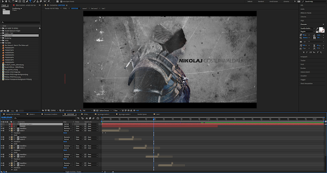
The background is composed of several layers of assets and effects (pictured below). At the heart of it is a plain white fill, warped by several layers of lumetri colour & curve manipulation - on top of which lies a static dirt texture which you can see on the outer sides of the background itself, as well as 2 animated textures that move around the screen in an authentic manner, thus providing a more readily apparent sense of movement to the title sequence as it progresses from one frame to the next. To complete the look there is a strong 'CC Vignette' applied to the top layer, thus darkening the outer edges of the background and completing the worn, grey look of The Witcher.
 A more detailed glimpse into the background itself can be viewed here (pictured right) - this should give more of a visual understanding to the work that went into creating said background. Once this was established, I was able to begin overlaying the necessary elements of the title sequence, including the double exposure images and of course the credits themselves.
 The text used for each of the credits was also created in After Effects. The font used was 'Eras Bold ITC' for the forenames, with 'Eras Light ITC' on the surnames. This was an artistic decision made in order to emphasise the cast and crew's first names while also diversifying the image somewhat. Several of the later credits also feature a subtitle which uses the same font, this time however in a rather juxtaposing blood red colour - emphasising the tone of this tale.
Putting together a professional looking, industry standard title sequence was one of my core aspirations during this project. In order to ensure I met the requirements of my ideal platform HBO, I underwent substantial After Effects work in order to create the aesthetic that I had envisioned for 'No Man's Land - A Witcher Series'. The meat of the sequence was composited within Adobe After Effects utilising a variety of techniques in order to create an authentic visual look that was both appealing to watch, whilst matching the tone and thematic nature of the world in which the series takes place.
 The double exposure effect was inspired by HBO's own True Detective series and allows for the overlay of a moving image onto a secondary static image. This is created through the use of complex masking techniques. Similarly the motion of these images featured throughout is controlled through several modifiers, including keyframe animation, 'wave warp', 'box blur' and 'venetian blinds'. By incorporating several layers of effects, the end result is much more authentic and professional.
The background is composed of several layers of assets and effects (pictured below). At the heart of it is a plain white fill, warped by several layers of lumetri colour & curve manipulation - on top of which lies a static dirt texture which you can see on the outer sides of the background itself, as well as 2 animated textures that move around the screen in an authentic manner, thus providing a more readily apparent sense of movement to the title sequence as it progresses from one frame to the next. To complete the look there is a strong 'CC Vignette' applied to the top layer, thus darkening the outer edges of the background and completing the worn, grey look of The Witcher.
 A more detailed glimpse into the background itself can be viewed here (pictured right) - this should give more of a visual understanding to the work that went into creating said background. Once this was established, I was able to begin overlaying the necessary elements of the title sequence, including the double exposure images and of course the credits themselves.
 The text used for each of the credits was also created in After Effects. The font used was 'Eras Bold ITC' for the forenames, with 'Eras Light ITC' on the surnames. This was an artistic decision made in order to emphasise the cast and crew's first names while also diversifying the image somewhat. Several of the later credits also feature a subtitle which uses the same font, this time however in a rather juxtaposing blood red colour - emphasising the tone of this tale.


Comments
Post a Comment