Major Project - Designing The DreamChaser Poster
Designing The Poster
Following our time at Brands Hatch on Tuesday, I was in the position to begin work on designing the official poster for our 'DreamChaser' documentary. Given my experience working with Photoshop in the past and designing posters for previous projects both on the television production course at UCA, and before that at GCSE/A-Level Media Studies. I revel in the opportunity to be creative in this way and I often always learn new things about the software I use during these processes.
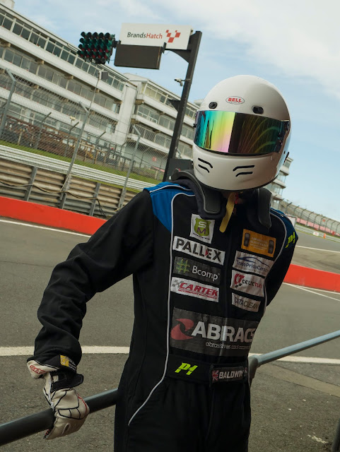
The original image that we decided on, shown in the previous blog post (see above), was chosen because it was a portrait-orientated image that incorporated all of the elements we wanted to get in there such as the sponsors, Alex's visor being the central piece of the poster and the Brands Hatch sign in the background. One of the techniques I had in mind going into this process was that I wanted to use Black and White filters to separate the foreground from the background - in this case I separated Alex and the railing that he's leaning on and the sign in the background, from everything else in the image (see below).
You'll notice that I also drew around the shape of the visor and adjusted the hue/saturation values in order to make the colour of the visor more accurately match with the colours on Alex's racing suit, furthermore the colour of the glove has also been adjusted to be more white rather than yellow like it is in the original image. This was a decision I made as the yellow tint to the glove was more noticeable against the black and white background. Another advantage to this B&W technique is being able to individually bring back in the colour to certain elements of an image in order to highlight them or compliment the rest of the image - you can see in the final poster version below that I decided to inject the colour back into the red barrier behind Alex, as it acted as a good center-piece, drawing people's eyes towards the center of the image.
The text itself is using the 'Xenosphere' font, a style that I chose during the late pre-production phases to be used in marketing and production material across the documentary. This will likely be the font used during the opening title sequence as well as the credits at the end of the documentary. In order to give it a more distinctive look I added a minor radial blur to both 'Dream' and 'Chaser' to represent the sense of speed that comes with motorsport, as well as masking out Alex's helmet so that it would appear as if it were in-front of the 'Dream' text, thus helping give the poster another sense of depth/layering. There's also the header and footer of 'An AFR Documentary' and 'Summer 2019'. Unfortunately in order to make the titles pop as much as they do, I had to cover up the Brands Hatch sign to make this happen, this is an issue with the framing of the shot, however of course this wasn't something we anticipated going into the photoshoot earlier this week.
This is the version that will be used to send out to Kickstarter backers, while the alternative version below will be used for submission to the university as part of our project hand-in.


Comments
Post a Comment