TV News Unit | Creating A Brand Appropriate Website
Website Design 101?
One of the things we left late was the website portion of the branding for Carology News, this was due to our focus on production and the need for last minute reshoots of various different material, either way thanks to useful online utilities such as Wix, website design has never been easier. As much as that sounds like a sponsored ad, unfortunately Wix are not paying me for this work.
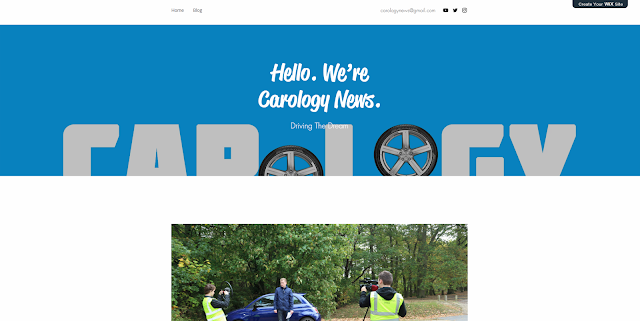
Either way, one of the key aspects of design I wanted to include within this website was minimalism. Minimalism to me is one of the most prominent visual styles amongst modern, professional content creator's brand design these days, take a look extremely successful YouTuber's MKBHD and UnboxTherapy, both of which employ a very simplistic design, while also effectively pleasing an audience aesthetically.
Thanks to Wix they make advanced visual features that would've been incredibly challenging to reproduce 5 years ago, extremely easy to implement. An example of this would be the parallax that occurs with the main banner image at the top of our homepage. This essentially means the image tucks away contextually as you scroll down the page, leading to a more satisfying experience for the viewer.
I also added a 'Today's Top Stories' section to emphasise the journalistic nature of our brand. This has a space for 4 articles offering key information points and an image related to the headline. It's also worth noting that the animations here have been designed so that the text and images seamlessly fade into existence as the user navigates down the page.
At the bottom of the website there are 3 links to the most recent publications to the website which I have added, adapting them from each of our own blog-posts throughout the project. I felt this was a nice touch as it provides additional substance to the website rather than just being a hollow 'http' representation of our brand.
The blog can also be accessed directly by clicking on the 'Blog' link at the top of the webpage. This brings you to the expanded blog area, detailing the most recent articles published, with an additional line or two of context touching on the topic of said articles. (Pictured below)
One of the things we left late was the website portion of the branding for Carology News, this was due to our focus on production and the need for last minute reshoots of various different material, either way thanks to useful online utilities such as Wix, website design has never been easier. As much as that sounds like a sponsored ad, unfortunately Wix are not paying me for this work.
Either way, one of the key aspects of design I wanted to include within this website was minimalism. Minimalism to me is one of the most prominent visual styles amongst modern, professional content creator's brand design these days, take a look extremely successful YouTuber's MKBHD and UnboxTherapy, both of which employ a very simplistic design, while also effectively pleasing an audience aesthetically.
 |
| The Homepage of Our Website |
At the bottom of the website there are 3 links to the most recent publications to the website which I have added, adapting them from each of our own blog-posts throughout the project. I felt this was a nice touch as it provides additional substance to the website rather than just being a hollow 'http' representation of our brand.
The blog can also be accessed directly by clicking on the 'Blog' link at the top of the webpage. This brings you to the expanded blog area, detailing the most recent articles published, with an additional line or two of context touching on the topic of said articles. (Pictured below)
Overall I find that the website has come out looking incredibly professional and provides some insight into both our brand and the production of our package/live piece. Not to mention multiple links to all of our social media, tying together the Carology eco-system.
Website Link: http://www.cailancook98.wixsite.com/carologynews


Comments
Post a Comment